
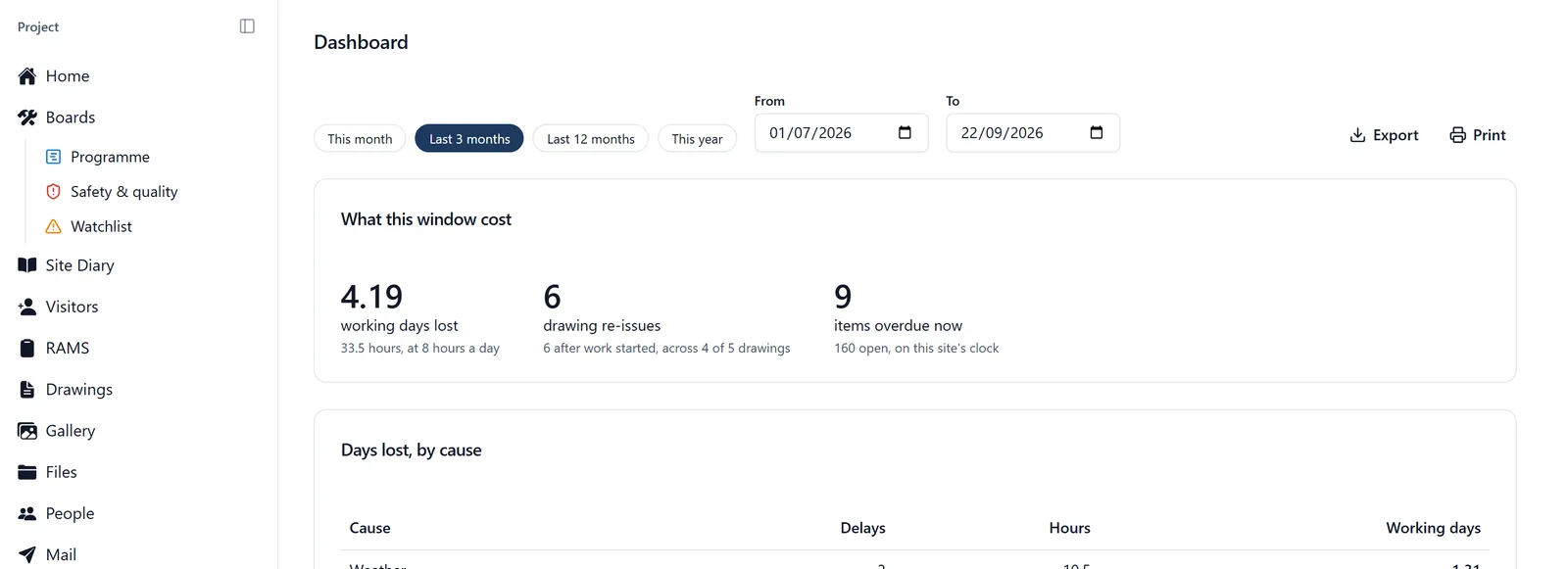
The Project Dashboard is one screen of numbers about your job: who is on site, whose cards are running out, what is overdue, how the work is going. It is for project admins only. On the phone it opens under the heading Site Intelligence, which is the same screen by another name.
In the browser it has two halves, and they answer different questions. At the top, the project report covers a date range you choose and can be printed or exported. Below it, Site Intelligence is live: what is true this minute, with no range and nothing to take away. The phone has the live half only.
How to get to it:
- On the phone: open the side menu (tap the three-line icon ☰ in the top-left corner) and tap “Project Dashboard”. The screen is headed “Site Intelligence”, with today’s date underneath
- In the browser: in the sidebar on the left, under the Admin heading, click Dashboard. The page is headed “Dashboard”, and the cards sit under a Site Intelligence heading with a green “Live” chip and today’s date on the right
- On a brand new project the browser sidebar is shortened, so the whole Admin group is behind “More” at the foot of it until the project is set up
If you cannot find it: it is admins only, on both. On the phone the side menu does not show it unless you are an admin. In the browser, a member or follower who opens the address anyway gets “Access restricted” rather than an empty page.
The project report (browser only):
It sits above Site Intelligence and covers a date range, set to the last three months when you open it, with buttons for this month, the last twelve months and this year, and two date boxes if you want something else. Every figure is counted on the project’s own calendar, so a day on a Manchester site is a Manchester day wherever you are reading it.
- What this window cost: working days lost, drawing re-issues, and how much is overdue right now
- Days lost, by cause: every delay recorded against the site diary plus every day the site was shut, totalled under one set of causes and divided by the working day set on the project (Project Settings, Working day). It reads the same records the Delay register does, so the two cannot disagree. A stoppage recorded inside a day that was already shut is listed but not counted twice, and the card says so
- Design churn: every drawing with the number of times it went out and the number of times it was re-issued, since the first issue is not churn. Broken down by discipline and by whatever you file drawings under (Plot, Floor, House type, Phase), and by how many re-issues landed after work started, which is the number that supports a variation. A drawing tagged twice in one group counts in both, so a group can total above the drawing count, and the card says that too
- How long work sits waiting: raised to closed, month by month, with how much came in, how much went out and the middle time it took. The middle rather than the average, because one task abandoned for a year drags an average somewhere no real task lives. Beside it the slowest tenth, and how much of that month’s work is still open
- The rest of the record: days somebody was on site, who checked in, diary days, photographs, drawings issued and superseded, then a table of every kind of work item with what was raised, closed, open and overdue
- How they went: the deliveries and inspections in the range, by outcome, with each one’s share of those that have been recorded. That gives you a pass rate and a count of what arrived short, which a count of inspections alone cannot. It appears only when the range holds deliveries or inspections
Where work started comes from: projects do not carry a start date, so the report works one out from the earliest scheduled start on the programme, falling back to the first item ever raised. It prints the date it used and where it got it, under the churn table, so the “after work started” figure is never a number with nothing behind it.
Printing and exporting it:
- Pick the range
- Print gives a dated report headed with your project name and the range, with none of the app around it: no buttons, and none of the live Site Intelligence half. Save it as a PDF from your browser’s print dialog
- Export gives a spreadsheet with every drawing and every month in it, for anyone who wants to re-sort the columns
Both say what they are: the window, the working day the figures were converted through, and where the work start date came from. Anything private is left out of the file, and the file says how many items it left out, even for an admin who can see them on screen. So what leaves the app is never quietly more than it appears.
Two things the “How they went” card counts differently, and both are deliberate. It counts a delivery or an inspection by the day it was booked for, not the day somebody typed it up, because that is the day it happened on site: so a delivery booked in February for a March slot is March’s. And an item with no date at all is in no range, because it has no day on site to be counted under.
Not recorded is its own row on that card, and it is not a failure. It means nobody has said yet how a delivery or an inspection went, which is the ordinary state of one booked for later in the week. The shares beside the other rows are worked out from the ones that have been recorded, so a month with most of its work still to come does not read as a bad month.
A blank report is not a clean job. Every figure comes from what your team recorded. No delays logged means no days lost, which is not the same as a job that lost none.
What each card tells you (Site Intelligence, the live half):
- Today (the four tiles at the top of the phone screen): Team Members, Compliance Issues (expired and expiring), Overdue Tasks and On Site Now. The browser has four tiles too, at the top of Site Intelligence. The first of them is Active Sites, which counts the projects you are on rather than who is on site now. They used to sit across the top of the Home page; the Home page now carries a short Project pulse for admins instead (tasks complete, open snags, open issues, and open tasks with no date) with a link through to this screen
- Project Activity: Photos (labelled “Gallery” on the phone), Plans, Open Issues, Time Saved. Open Issues counts every issue and snag raised on this project, whether it is still open or not. Time Saved is an estimate, three minutes for each check-in recorded, set against signing a paper sheet
- Task Progress: a green and red bar. In the browser a line above it says how many of how many tasks are complete, with a key underneath for Done, Overdue and Remaining. The phone puts the four figures (Done, Overdue, Remaining, Total) under the bar. It counts tasks only, not issues, snags, RFIs, deliveries or inspections
- SiteBot Usage: how much your team uses me. Sessions, Active Users and Questions Asked, plus Tokens Used once there are any, which is a rough measure of how much has been said. A thumbs up and thumbs down count appears once somebody has rated an answer. These are counts and nothing more: the card never shows what anybody asked, and there is no way from it into somebody else’s conversation with me
- Site Presence: everyone on the project, on site first, each marked On Site or Off Site with their hours so far today. The browser adds an Arrived column, filled in for whoever is on site now. The phone lists five and “Show all” opens the rest in place. The browser lists eight and the link underneath takes you to the People page
- Peak Site Hours, called Site Presence by Hour on the phone: a bar for each hour of the day, built from the last 30 days of check-ins, with the busiest hour picked out and named in a badge. In the browser the line underneath also names the busiest day of the week. On the phone, tap a bar to read that hour’s figure
- Compliance & Certification Risk: every card that has expired or runs out within the next 30 days, worst first, each saying how long ago it went or how many days are left. If any have expired, a red line at the foot of the card counts them and warns of an HSE shutdown risk. When there are more than five, a link under the list opens the full one: Compliance in the browser, Team Compliance on the phone
- Drawing Awareness (browser only): for each drawing, how many of the people who can see it have opened the current revision, worst first, with a bar and the names of up to three who have not. A drawing that has been reissued and that fewer than half the team has opened carries a red Rework risk badge, and a red line at the foot counts them: those are the sheets somebody is about to build wrong from. A first issue nobody has opened yet is not badged. Opening a drawing counts on the phone as well, including with no signal, and saving one for offline, downloading it or opening it in a new tab counts too. It records that a sheet was opened, not that anybody has read or understood it. Only project admins see the whole picture; everybody else sees their own reading and nobody else’s. The people counted are the admins and members, not followers
- Working Hours vs Site Presence, shortened to Hours vs Presence on the phone: this month, one row per person. Hours on site, and days on site out of the days the month has run so far (that second number counts weekends, so nobody looks absent for taking a Sunday off). Hours on site are counted exactly as the Time on site view counts them: a check-in nobody checked out of stops counting once it is more than twelve hours old, rather than running on for days. Three flags to watch for, in this order: No check-out, for a check-in that counts no time until somebody corrects the record; Low attendance; and Excessive hours for a daily average over ten hours, marked as a fatigue risk. In the browser everyone else reads OK, and the Reported column shows the hours each person put on their timesheet this month, or Not reported. The two figures are never added together. On a job nobody checks in to, the card shows the reported hours on their own and says why
- Needs Your Attention: the short list, red or amber. Expired certifications, overdue tasks once there are more than three of them, and certifications going within 30 days. Nothing wrong reads “Everything looks good”
Across All Your Sites, at the foot of the page: Site Attendance gives one row per job you are an admin of, with how many of its team are on site out of the total, and a coloured dot (red for an expired card, amber for a card about to go or for fewer than three in five of the team on site). In the browser each row also carries that site’s weather and a note when it matters, such as “High winds: crane and scaffold risk”. Task Progress by Site sits beside it once you run more than one job. In the browser both cover the organisation you have picked at the top of the screen. On the phone the whole section appears only once you run more than one job.
Apart from the Reported hours, which people put on their own timesheets, nothing on this page is typed in. Check-ins make the presence and hours figures, the cards on people’s profiles make the compliance ones, your team’s tasks make the progress bar. An empty card means the thing behind it has not happened yet, not that something is broken.
Nothing can be changed from here either. It is a page you read. To correct a check-in time, use Site Presence (the “timesheet_corrections” topic). To fix or add a card, use the person’s profile or Team Compliance (the “certifications” topic). To change what the report counts, record it: delays go on the diary day (the “delay_register” topic), and the working day a full day converts through is in Project Settings.
On the phone with no signal, an amber banner appears at the top saying you are offline and the figures may be out of date.
Or just ask me. You do not have to open the dashboard for most of these numbers: “Who is on site?”, “Who has an expired certification?”, “How many tasks are overdue?”
Catching up on what happened while you were away:
This one you ask me for rather than open, and it works over a stretch of time rather than about one task:
- “What have I missed this week?”
- “What’s happened since Friday?”
- “What has Dave been up to this month?”
I come back with what that stretch holds: photos added, tasks raised, check-ins (and how many days they cover) and announcements posted, with a card naming the most recent of them. A week on a busy job is a lot to read, so narrow it when you need to: one person, one kind of thing (“just the photos since Monday”), or a shorter run of days. This one is for everybody, not just admins, and it works on the phone and in the browser.
Who can do what:
- Only project admins can open the Project Dashboard, on the phone and in the browser alike
- Members and followers cannot see it. On the phone it is not in the side menu, and in the browser the page answers “Access restricted”. The only way to give somebody it is to make them an admin of the project
- Anyone can ask me what has happened lately. For a follower, the tasks in that answer are only the ones they are involved in, because that is all they can see (the “permissions” topic)
- Reading the dashboard changes nothing, so nobody can break anything by looking